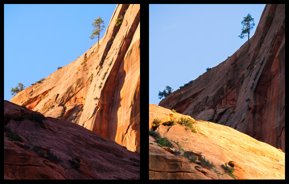
Which of the two photos above do you like better? Why?
Both photos are very similar, but one was shot at sunrise and one was shot at sunset, so different parts of the red rock were lit up by the sun.
There’s no right or wrong answer here. The reason I’m asking the question is to get you thinking about composition, and specifically help you think about your own unique perspective of the world.
Personally, I like the first shot (on the left) better. I like the shaded part at the bottom of the frame because I think it anchors the image better. Since our eyes are drawn to brighter spots first, I feel like it makes more sense to put the dark stuff at the bottom of a landscape image. That way, your eyes naturally lead towards the back of the photograph where you have a dramatic lit-up subject (such as a mountain peak at sunrise).
I’m also a big fan of contrast, and I feel like the first image has a better arrangement of color. I think the blue sky next to the glowing red rock creates a much stronger contrast than the arrangement in the second photo (with the blue sky against the shaded rock). Again, there’s no right or wrong answer here, these are just some thoughts that go through my head when looking at and composing these types of images.
What do you think? Agree? Disagree?
Let us know what you think by leaving a comment below. I think it’d be great to get a discussion going about composition. There’s a lot we can all learn from each other 
Would you like to see more comparisons like this?
This is a new style of post I’m trying out, so I’d love to hear your feedback. Was this kind of discussion / thought-exercise helpful? Would you like to see more side-by-side photo comparisons like this? If so, please let us know by leaving a comment below. Thanks!
Get more great tips in our free weekly newsletter.

 About the Author: Steve Berardi is a naturalist, photographer, software engineer, and founder of PhotoNaturalist. You can usually find him hiking in the beautiful mountains and deserts of southern California.
i like the right one because the composition & mettering are ok.
excuse me i had mistake i like left one
I took the liberty of downloading the left image and converting it to black and white in PSE 11 . Result was quite pleasing and reminded me of the superb work of Ansel Adams in similar places. Brought up on monochrome sixty years ago with my first camera I still love it . Some colour to B&W conversions might be the basis for another article of this kind ?
Love the contrast between light and shadow in the left one.
I like the left one best, How do you change the dark with the light or is that a secret
I really like these comparisons. I’d love to see more of these, as it makes me think there are other ways to compose/light an image. Thank you!
I like the left one. More natural. Seeing a dark object in the background does not balance right.
I enjoy reading your comments and advice. Very helpful
I like the left one. I prefer this color arrangement, and also the more natural-looking tree colors.
I would definitely like to see more side-by-side comparisons like this. The comments on both sides are well worth reading and make a useful addition to the post.
Yes, I would like to see more comparison like this one as it makes one think why something work or not.
Personally , I like the right one better. The way my eyes are drawn to the front where the light is and then wander to the back on there own to explore the rest of the photo. Where else on the left photo my eyes jump to the light part in the back and then have to pretty much jump down (feels like having to step pack a few steps ) in order to see the rest. Anyhow, that is just my 2 cents worth.
Yes, I too liked the second one. My eyes were immediately drawn to the rock at the front and then went to the back of the picture. I would like to see more of these comparison photos because they make you think a lot more.
I’m for the right one, mainly because my eye hits on the lower/lighter area and then wants to explore the rest of the image. The fact that it’s in shade intrigues me, and I want to delve more. As you say, no right or wrong, but it is an interesting exercise.
I definitely would like to see more of the side-by-side comparisons. I learned a lot from your comments. At first, I had selected the one on the right because I thought there was more detail in the shadows of the larger rock wall. However, I can also see the rationale for the left picture being selected. The choice truly lies in the eye of the beholder but it never hurts to try to look at things through another person’s perspective.
I agree with Stephanie’s comments, and would also like to see more comparisons
Thanks everyone for your awesome comments!! It looks like everyone liked this style of post, so I’ll definitely continue to do them in the future
I like the one on right. would love more side by sides.
many thnks Denise
I prefer the image on the left. The contrast in the image on the right seems unnatural. All detail in the cliff is lost and the bright foreground seems to be to dominant.
One positive point regarding the image on the right is that the 2 diagonal lines show up better thus making the composition stronger.
Regards from The Netherlandsn
Ben