
That term “vision”—what does it mean? For me it’s simple. When I get home from a day of shooting, I review all my photos. I intentionally look for the images that stood out when I first saw them through my viewfinder. However, I usually get confusingly disappointed when I realize the camera didn’t capture the scene exactly the way I “saw” it—or maybe the way I thought I saw it?
But, don’t take my interpretation to be the most meaningful. Perhaps we should go to the origin of my inspiration on this topic: a book written by David duChemin titled, Vision & Voice, Refining Your Vision in Adobe Photoshop Lightroom. This book is a must for anyone that seeks to find their style, their purpose and their “voice” as duChemin calls it and articulates these concepts both eloquently and brilliantly. His writing makes you want to become a better photographer in every aspect, from your initial capture all the way through post processing. Why? Because your photography should have an end purpose, it should have substance, not just a recording of an event or a scene. Read the book and you’ll quickly know what I mean.
So, what prompts me to discuss this? Well, for one, I’d like to dispel some preconceived notions that post-processing is somehow impure or that it taints and manipulates. I think in these days where there’s evident criticism of Photoshop to the point that a meaningful noun becomes a verb with a negative connotation, then we need to take a step back and ask ourselves what do we want out of our photography: a mere snapshot record of what the camera captures or something else?
That “something else” for me is art and to make art you need to have a vision at the moment of capture and carry that with you all the way to achieving the final result. I think if you don’t have vision and don’t have a perfect representation of it straight out of your camera, which is hardly ever the case, then you need to complete your vision in post processing. If you don’t, then your photos may never be unique and characteristic of who you are. In other words, anybody who happens upon a scene could’ve taken the same shot and have it look no different than your shot. If that’s fine with you, then you can stop reading this right now. If it isn’t then read on…
Take this photo of a Red-tailed Hawk I came upon in east-central Kansas in late December 2014. The day was overcast with a thin layer of clouds and subtly diffused sunlight. My camera was a Canon 7D with a Canon 500mm lens and a Canon 1.4x Teleconverter. I shot it from my vehicle and handheld with these settings: ISO 400, f/6.3 at 1/800, with IS on.
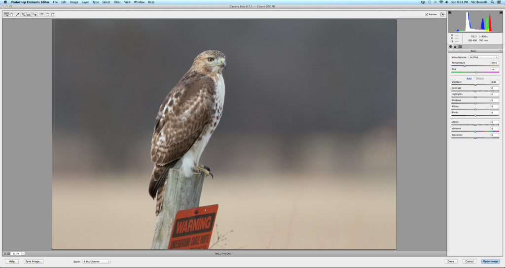
Above is that image brought into Adobe Camera Raw 8.7.1, untouched straight out of the camera (or, SOOC as some like to say). You can see the sliders from Exposure down are all set at zero. I’ll have to leave the color temperature portion of this to another discussion as I usually set my camera in an auto color temperature setting. The photo here is reasonably sharp, nicely exposed and the composition is adequate, but it has a lot of dead space and in my opinion, lacks depth. Problem is, I remembered the bird had looked much more striking when I actually saw it with my eyes only and not the way the camera interpreted it.
So, to bring the art into this scene I had to visualize where I wanted to go with the image. I felt the overall tone lacked contrast and intensity. Just a nice photo of a cooperative bird. Of course, many photographers would be happy to leave it here at this point, convert it into a JPEG file and move to the next photo. It’s a perfect recording of the sighting of this bird and nothing more. I didn’t leave the image “as is” though—or maybe I should say, I couldn’t. So, here’s where I went with it and why…
The first thing I did was attempt to draw the bird forward and separate it from the background. You can see I made adjustments while still in Camera Raw by creating more contrast in the scene without an adjustment in color other than a slight increase in Vibrance. The Clarity slider is an enhanced contrast tool that will generally improve any photo taken in dull lighting. But, I caution here that unless your photo is perfectly exposed, the Clarity slider may bring in a good amount of noise that will be troublesome further down in post-processing. It all starts with exposure, keep that in mind.

After I click on Open Image (lower right), my next step is to crop the photo for framing. I’ve always been a firm believer that photos were meant to be framed and hung on a wall. But, it’s sad to say, most photos never make it that far and never leave the computer screen. On this particular photo, I chose 8 X 10 which is the same ratio for a 16 X 20. I like 16 X 20 for my best photos because the larger the display the better in my opinion.
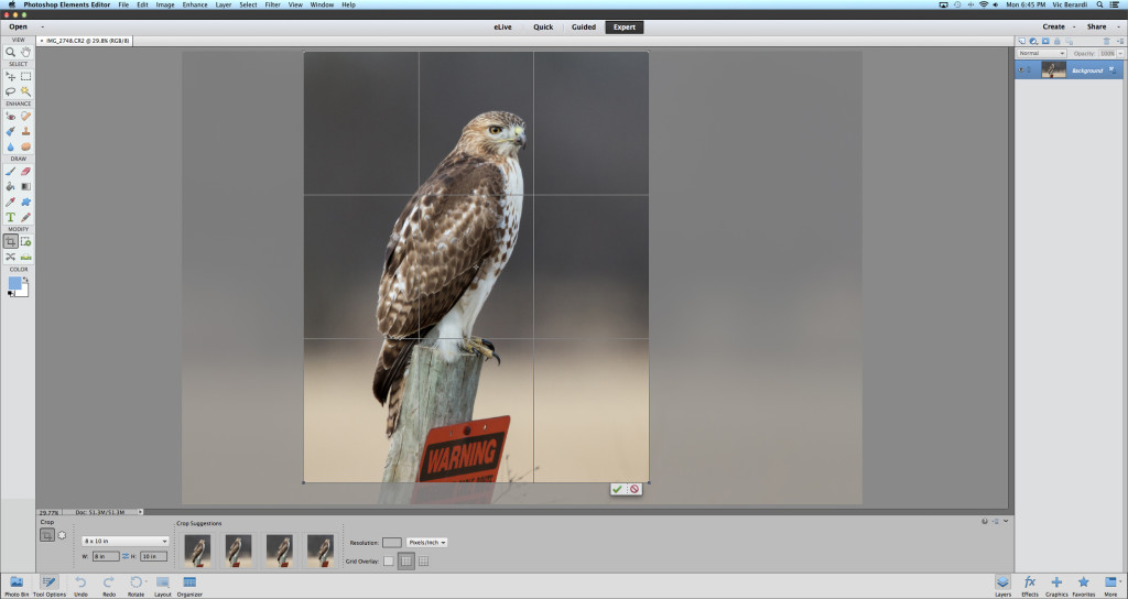
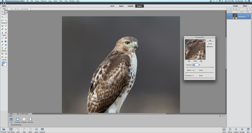
If I proceed to process this image for printing and framing, I will further make adjustments in the Sharpening section of this software. But let’s assume you just want to share it with friends via social networking through the Internet. So, the next step is to Resize the image.
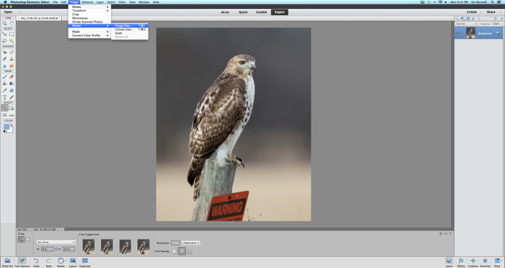
A good representative size for most photos is to be at least 1000 pixels wide. Here I chose the width to be at 1200, making the Length come to 1500. I generally like to make sure the resolution is above 200. Also, for reduction in size I usually go with the Bicubic Sharper setting. Utilizing this setting was discussed in an earlier post here on PhotoNaturalist.
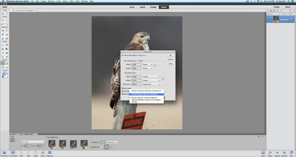
Next is the sharpening phase. I generally sharpen my photos using the Unsharp Mask filter, with the Amount set around 400% or less depending on the size of the photo. I also set the Radius at 0.2 pixels and leave the Threshold at 0.
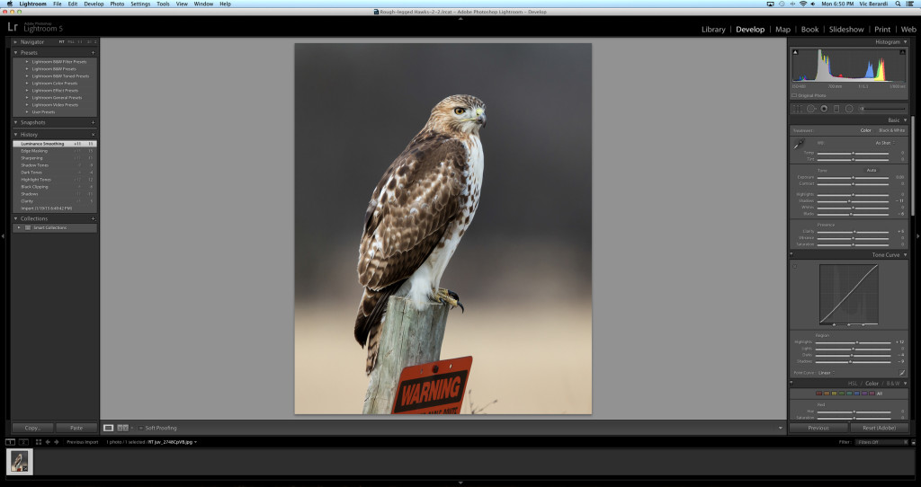
My final step is to further tweak the image in Adobe Photoshop Lightroom 5. Here you can see the adjustments are very minor, although I did allow more depth in adjusting the Shadows slider a bit more. It is also here in Lightroom that I address noise in the image. But, I’ll leave that for a later discussion because that topic can be very lengthy if it is to be fully understood.
So, here is my final image and you can see the comparison with the initial RAW image. This post-processed image represents the feeling I had when I took the photo and how the bird looked so regal and distinctive. In the initial untouched image I didn’t see that, so I needed to achieve what I wanted through the software. Yes, some other photographers may or may not push the image this far. And that’s fine. If we weren’t all different and all our photos looked the same, then I believe it would become a very boring world. I also believe everyone wants to see artful depictions of nature and not just representations of a scene.
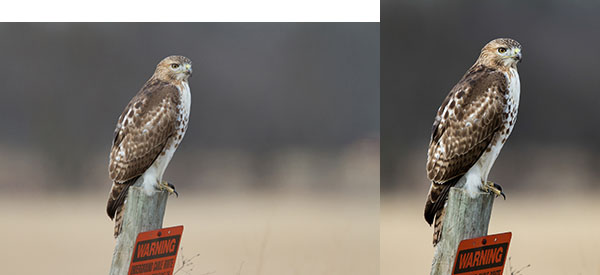
And yes, the question still will be asked, is this right or wrong? Is this manipulation or deception? Personally I do not think so. Nothing in the image is fake, no stars, moon or other objects have been added to create something false. But the real question is which image is better? The initial RAW image or the final post processed image? You’ll have to decide for yourself, I already did…
One last note from Steve: Don’t forget to check out my Dad’s blog for more great stuff on hawks!
Get more great tips in our free weekly newsletter.
 About the Author: Vic Berardi is a raptor lover that lives in the Midwest. He is the founder of the Illinois Beach State Park Hawk Watch and every weekend of the year you’ll find him searching for hawks and photographing them. Several of his photographs have been published in a leading raptor journal and in articles he has written. During the year he gives presentations teaching others about hawks and hawk migration. Vic also photographs dragonflies and wild flowers and is always respectful of nature and its creatures.
Thanks for the thoughtful essay. For me, the question is, can photography be a medium for artistic expression and communication? No one ever asks or rebukes a painter if he or she “changed” the scene. No one asked Dali if the clocks were really melting. When I want to express in two-dimensional form the three-dimensional scene that I experienced or envisioned, I want to use any tool I have, whether it be film choice; filter color; setting the aperture, shutter speed, and ISO; darkroom printing, or post-processing.
In my opinion, if you are only enhancing the colors or contrast or cropping a shot, where is it different doing it in Photoshop than in an “old school” darkroom with film? I always do some bit of enhancement to my work. Perhaps the lighting just wasn’t what I wanted, or I couldn’t get as large an image of the subject.
On the other hand, if you are adding or removing some element in a shot, it becomes a composite. I have made composites, such as adding “ghost” looking dinosaurs to a scene, but I always mention in the description that it is a composite.
Just like in paintings, it is a vision that the photographer wants to pass on to viewers.
Great piece on editing Vic, and excellent results!
I just import my RAW files to LightRoom, do White Balance correction, and lens Profile etc.
The do editing using following NIK plugins in this order: Dfine – Noise remover, Viveza – Light enhancemnet, Color Effex Pro – using 3 -4 presets in that Module and Nik Out Sharpener Pro. Before reporting the finished photo in LR, I may add a Tone Curve, or Vignette. All depends on the subject, and mood I want to convey in the processed image.
Once again, excellent editing job Vic!
Sorry for the typos in previous post 🙂 I meant to type “Exporting” not “reporting”. DARN auto correct LOL